16

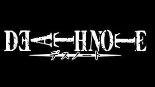
In the original Japanese Death Note title:

DN Logo

  • the first E is backwards (or, equivalently, rotated through 180 degrees)
  • the A and Ts are rotated 90 degrees anticlockwise, and
  • the N is rotated a few degrees clockwise.

Do any of these stylistic choices have a known significance, or were they chosen at random?

4 Answers 4

10

They're definitely not random. From an artistic perspective, this typographic choice accomplishes 3 things:

  1. The 90 degree rotation of the Ts and the A form the shape of an arrow or a knife tip. The E in front of this "tip" is reversed to make sure this can be seen easily--the back of the letter forms an uninterrupted surface that the "arrow" is striking. If the E was the right way, it would look a little like a knife fighting with a fork, so kinda silly. Overall, the design has the letters of "Deathnote" form a weapon. This echoes the mechanics of the plot, where the letters you write in a Death Note are literally the weapon that kills someone.

  2. The title has "death" in it, and the show in general has people being killed off. In fact, one of the main points is to see who is smart or lucky enough to survive. The typography cleverly suggests this theme. Some of the letters are already "horizontal" because of reason #1 above. Tilting the N slightly makes it look like the letters are keeling over one by one, connecting the typography to the theme of people dying off.

  3. Why is N specifically chosen to be tilted? a) because it's in the middle of a 3 letter block, so for compositional reasons b) it also might be the artist being cute by hinting at the character N and trying to foreshadow his role by drawing attention to that letter.

So basically, one answer is that typography is being used as an artistic device in many ways to suggest themes in the show. There may be other, non-artistic reasons that I'm not aware of, so additional answers are possible. That's the beauty of visual art, it can do many things at once on many levels.

3

I'm guessing it's for aesthetic purposes, but here are two things I noticed:

Horizontal Line of Symmetry

  1. All of the letters except 'A', 'T', and 'N' have a horizontal line of symmetry.

  2. After rotating the 'A' and 'T's 90 degrees, they also have a horizontal line of symmetry.

  3. 'N' doesn't get a line of symmetry, but the tilting brings it closer to having its center line be horizontally symmetric.

It doesn't explain why the first 'E' is flipped and 'N' remains an exception.

Imagery

It's easy to see people or objects (i.e. weapons as mentioned on filistinist's answer) in the letters after tilting them sideways.

2

It kind of looks like the E's are brackets. If you focus on everything in between, it looks like an arrow piercing H, N, and O. The last T's head is showing a point of impact. And though it might be weird to imagine, if you see the O as a breast and the H as someone's back, it makes it seem like the N is the one feeling the effect of the arrow first. Since the N is in between the two, you could say it's a heart. The N, or heart, being the first to be affected by the "arrow of letters" could be hinting towards how Light writes down the names of his victims as they die in his signature killing style: a heart attack.

It's really just speculation, though; I could be wrong. It seems fitting to me though.

If you didn't see the E's as brackets, then the last E could be the feathers of the arrow, and the first E could be a shield to stop the arrow's path. Why would there be a shield there? Well, look at what would be using the shield. A D, for "death". The one thing that would stop Light's arrow of fatal words would be his own death.

That's all that I was able to come up with, but I think it's pretty plausible now.
0

The rotated letters could symbolize an arrow through the chemical symbol, HNO, of nitroxyl, which has been found to cure/treat heart failure. This analysis is just a theory, though.

You must log in to answer this question.

Not the answer you're looking for? Browse other questions tagged .